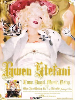
The first magazine advert that I have decided to look at is of Gwen Stefani. There is a lot of typical features in this advert such as the name of the Solo artist, as well as the name of the album (love.Angel.Music.Baby) and the official website where you can buy or download the album. You can also tell which shop you can buy it from.
By the colours shown throughout the advert, the category for this type of music i feel would involve Pop music with an edge.
The images used in this advert are of the solo artist as well as the album front cover. The image is of Gwen Stefani on a throne looking chair with a crown. This could show that the album will have a glamorous feel and that she is the 'Queen of pop'.
The text that has been used is the same throughout the advert and is also the same colour. The font of the text has a decorative pattern which in victorian times, would be expensive and luxurious. The colour also resembles gold which goes well with the image of Gwen Stefani as she looks like a queen and royal people tend to be rich and have gold. The text and the image have complimented each other well as the colours match.
Gwen Stefani represents
herself in this advert as she is well known for her bleach blonde hair and on this advert it has been shown to great extent. The advert doesn't really say much about the music, only which known songs are in the album however just by looking at the advert, you can get a feel for the type of music, with it being light coloured you think of pop.
What I have learnt by looking at this advert is that there is no need to put on a lot of words as people will probably just glance at the advert and take a small notice of when it is out. The better the image, the better the advert.
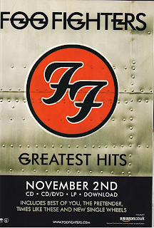
My second magazine advert is from the band, the Foo Fighters. This magazine advert is completely different from the advert involving Gwen Stefani. Firstly, there is a logo in the centre of the advert which resembles the band whereas in the other magazine advert, there is no logo, only the artist.

On this magazine advert however there is no band or artist on the ad at all. If I had to categorise this advert, I would say that has a slight edge and would say that the type of genre for this type of music would be either Indie or Rock.
The colours used on this advert show that the band is not targeted at a specific gender, however the style of written is quite modern. I therefore feel that the ideal people that would be listening to this type of band would be a mixtures of males and females and I think that the majority of them would be teens and young adults. I couldn't imagine a pensioner listening to them although I can't imagine them
liking the magazine advert though either. The same type of text has been used throughout this advert and it also involves the release date(November 2nd), the band's name(Foo Fighters) and also what the album is called(Foo Fighters Greatest Hits). Since the background seems quite basic and there is no image of the band itself, it is clear to say that the band is well known to not have an image and to be called 'Greatest Hits' signifies that they have had a few previous albums.

No comments:
Post a Comment