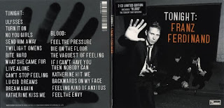
The digipak i have decided to look at is the album of Franz Ferdinand. I have chosen this digipak in particular because this is the type of music we intend to use for our music video.
The images used in this digipak consist of the band in general and also the singer's hand on the back cover. The full back, front and the spine of the cover is all in black and white apart from the band's name. This adds a dramatic feel to the album cover and because the colours are black, white and orange, they trigger a wide audience since the colours are all neutral. The font for all of the writing is white which makes it much easier to see and is also in capitals. Capitalisation is often used to get someone's attention so having the writing positioned near the band members has grabbed the attention of the audience as people tend to look at images first rather than words. The text and images give a slight masculine feel to the album cover as the writing looks edgy as well as the tone of the images which also give them an edgy feel. The image on the back also has a connection to the front image as it has the singer's hand on the back cover.
By looking at this album cover I can automatically tell that this band do not sing pop or rap. This band seems to like stuff that is quite quirky or they wouldn't have designed an album cover like this so i therefore suggest that the type of music that they create is slightly indie/rock. In this album there is an extra disc inside which is exclusive to the album. In the top left corner there is a sticker/sign that says 'Limited Edition, 2 disc special'.
The album cover does not consist of the album being a first album or there last, so it looks like it's a mainstream album from the band.

No comments:
Post a Comment